Comparing group differences for examining treatment effectiveness is a common
practice in research and evaluation. Parametric procedures such as t-tests and F-tests are widely
used for this purpose. However, those procedures are not very informative
because the conclusion is nothing more than rejecting or failing to reject the
null hypothesis.
APA Task Force on Statistical Inference (Wilkinson, 1996) endorsed the use of confidence intervals (CI)
as a supplement to conventional p
value. In hypothesis testing the p value is defined as the probability
of observing the statistics at hand given the null hypothesis is true.
On the other hand, use of CI does not rely on the assumption about the
truth of the null.
By using CI, the researcher can look
at the group differences by sample means, sample size, variability, and the estimated population means. As the sample size
increases, the variability decreases, and the CI gets narrower. Why should we
judge the quality of a CI by its narrowness? Take this scenario as a metaphor:
You ask me to guess your age, I reply, "from 16 to 60." I am 95% confident that
your actual age would fall within this range, but is it a useful estimation?
Probably not. If I say "from 18-21" instead, it is definitely a much better
answer.
There are at least two ways to view a CI:
- A Fisherian who subscribes to the objective, frequentist philosophy
interprets a confidence interval(CI) as "Given a CI of 100(1 - alpha),
for every 100 samples drawn, 95 of them will capture the population
parameter within the bracket." It is important to point out that this
is not a probabilistic statement. It doesn’t mean that there is a 95%
chance that the true population parameter is in the CI. Rather, the
true parameter is either inside or outside the CI. According to
the objective school of
probability, the population parameter is constant and therefore there
is one and only true value in the population. In other words, the
parameter is fixed whereas the CI is random.
- However, in the view of Bayesians, the same CI can be
interpreted as "given a CI of 100)1-alpha), the researcher is 95%
confident that the population parameter is bracketed by the CI." It is
important to note that in the second interpretation "confidence"
becomes a subjective, psychological property. It is valid to say that
there is a 95% chance that the parameter is in the interval. In other
words, Bayesians treat the population parameter as a random variable,
not a constant or a fixed value.
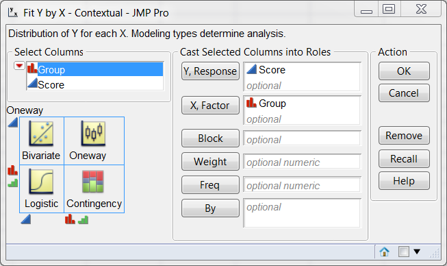
SAS/JMP provides a powerful tool named diamond plot to visualize CI.
The JMP tool is so easy that you don't even need to know the name of
the procedure. As long as you know what your dependent and independent
variables are, you can simply choose Fit Y by X from the Analyze menu, as
shown in the following:
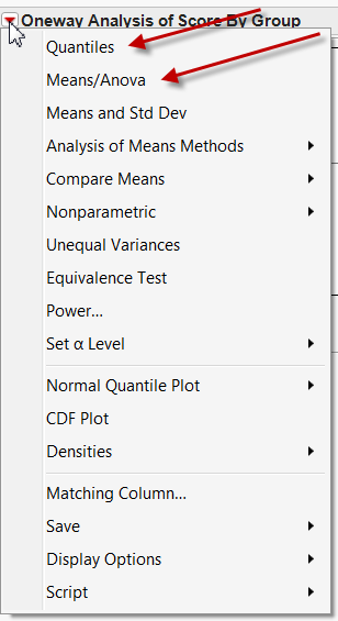
JMP provides the user with a contextual menu system and thus you would not be
overwhelmed by too many options. In the next screen only the options that are
applicable to the data structure are available to you. At this stage, you can
select Quantiles to display the box plot and Means/Anova to
display the diamond plot.
The result is shown in the following figure. It condenses a lot of important information:
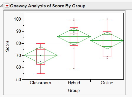
- Grand sample mean: it is represented by a horizontal black line.
- Group means: the horizontal line inside each diamond is the group mean.
- Confidence intervals: The diamond is the CI for each group. Because
the population parameter is unknown, there is always some uncertainty in
estimation. Thus, we need to bracket the estimation. Take photography as an
analogy. If the photographer is not sure whether the exposure is correct, he
would take at least one over-exposed photo (upper bound), one under-exposed
photo (lower bound), and one in the middle. In the JMP output, the top of the
diamond is the upper bound (best case scenario) while the bottom is the lower
bound (worst case scenario).
- Quantile: In addition to CI, JMP also provides the option of overlaying a boxplot showing quantile information.

In this hypothetical example, Professor Yu taught three classes in different
modes: Conventional classroom, online class, and hybrid class. He wants to know
which method could yield better exam scores. It is obvious that the performance
gap between classroom group and the two others is significant, because the
upper bound of the classroom group is close to the lower bound of the other
two. However, it seems that the difference between the hybrid group and the
online group is not substantive at all because there is a lot of overlapping
between the two groups. If you need to report formal statistics, you can extract
the appropriate information below the graphic.
When I was a graduate student, I took a course in multiple
comparison procedures (MPC) as a post hoc step after ANOVA. At most the F test
of ANOVA could tell you whether one of the means differ from one of the other
means. In order to test which pairwise difference is significant but control the
Type I error rate at the same time, different MPCs are needed. The course
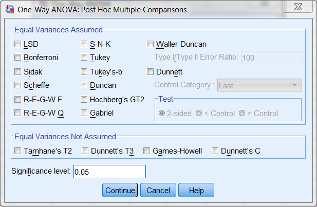
required the learners to memorize the pros and cons of 10-15 tests, such as LSA,
Bonferroni, Ryan, Tukey, Duncan, Gabriel...etc.. To tell you the truth, today I
forgot most of the information. The following is a screenshot of MPCs offered by
SPSS. You can tell how confusing it is. In my opinions, the diamond pot is a
much quicker and easier way for group comparison.
However,
it doesn't mean that we can totally ignore post hoc multiple
comparison. On some occasions it is still useful for verification when
the situation is ambiguous. Take the preceding case as an example
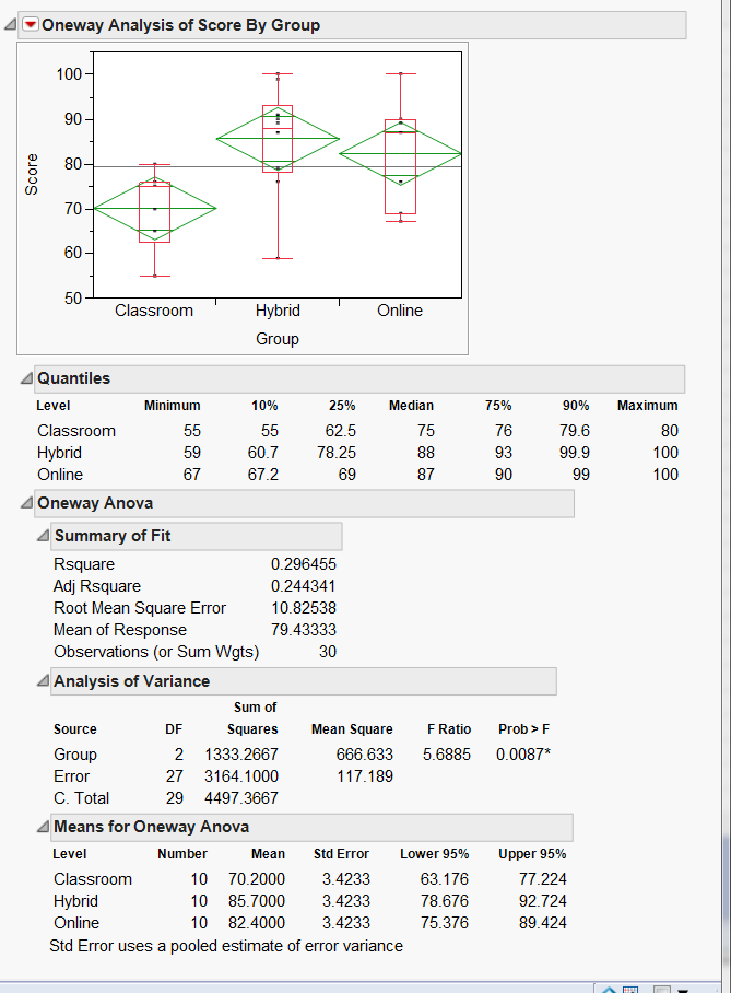
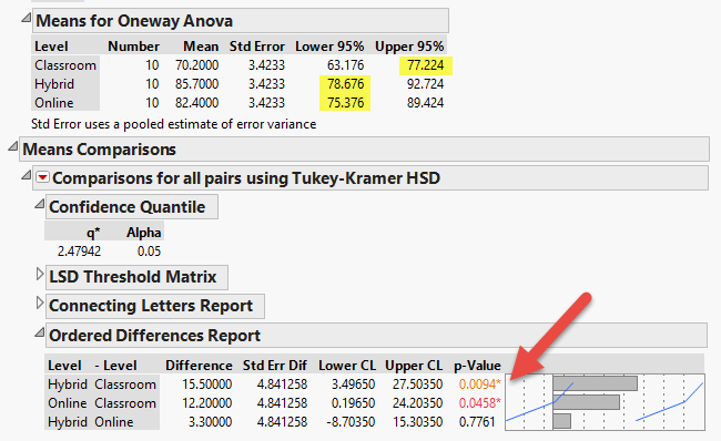
again. If we infer from the sample mean to the population mean, the
best estimate of the classroom group mean is 77.22 while the worst case
scenario of Hybrid is 78.676 (see the yellow highlight in the figure
below). No doubt in my mind Hybrid is better than Classroom. However,
the lowest estimate of Online is 75.76, which is below the best
estimate of Classroom. Indeed, while the diamonds of Classroom and
Hybrid do not overlap, there is a bit overlapping between the diamonds
of Classroom and Online.
When we make a decision based on the CI, we can accept that a bit
overlapping may still imply significance. The question is: how much is
considered "a bit"? Nonetheless, if you look at the Tukey test result
(one of the post hoc tests), it is obvious that both Hybrid and Online
significantly outperform Classroom (p = 0.0094, p = 0.0458, respectively; see the orange and red numbers in the figure below).
Further, Payton, Greenstone and Schenker (2003) warned
researchers that inferring from non-overlapping CIs to significant mean
differences is a dangerous practice, because the error rate associated with this
comparison is quite large. The probability of overlap is a function of the
standard error. As the standard errors become less homogeneous, the probability
of overlap decreases. Simulations result showed that when the standard errors
are approximately equal, using 83% or 84% size for the intervals will give an
approximate alpha = 0.05 test, but using 95% confidence intervals, which is a
common practice, will give very conservative results. Thus, researchers are
encouraged to use both CI and hypothesis testing.
References
Payton, M. E., Greenstone, M. H., & Schenker, N. (2003).
Overlapping confidence intervals or standard error intervals: What do they mean
statistical significance? Journal of Insect Science, 3(34). Retrieved from
http://insectscience.org/3.34
Wilkinson, L, & the task Force on Statistical Inference. (1996).
Statistical methods in psychology journals: Guidelines and explanations.
Retrieved from
http://www.apa.org/science/leadership/bsa/statistical/tfsi-followup-report.pdf
Return to Index