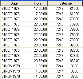
data table1b;
set
table1;
datetime=dhms(date,0,
0,
hour);
format
datetime
datetime12.;
if datetime NE
" "
then
case = 1;
run;
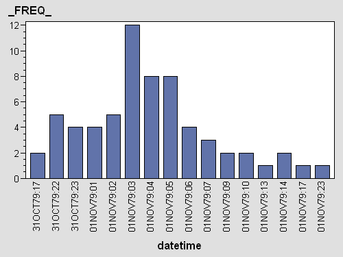
proc
summary
data=table1b;
class
datetime; var
case; output
out=outbreak
sum=sum;
run;
data outbreak;
set
outbreak;
if _TYPE_ =
0
then
delete;
run;
goptions
reset=all
device=actximg;
ods
html
file="outbreak.html";
proc
gchart
data=outbreak;
vbar
datetime /sumvar=_FREQ_
discrete
; run;
goptions
reset=all
device=actximg;
quit;