|
On Symmetrical Composition |
|
Chong Ho Yu, Ph.D. |
|
|
Human perceive vertically and horizontally symmetrical compositions differently. I would like to offer an explanation why the latter is more acceptable than the former in an aesthetical sense. I am a psychometrician rather than a cognitive psychologist. What I discuss here is based upon my personal opinion rather than empirical substantiation.
| Vertically Symmetrical Composition |
In the last century quite a few British photographers such as Edward Fox and Robert Hewlett liked to place the subject at the center of the picture. However, when I was an art major, one of my art professors warned that centering a tall subject on a picture would divide the space into two symmetrical halves. Consequently, the two equal sides would generate competing interests. Without a dominated portion or a tension created by contrasting elements, the picture would not be aesthetically pleasing.
Figure 1 Figure 2 For example, in Figure 1, the tree cuts the space into two pieces. This photo is definitely uninteresting. However, when the sun appears on the right (Figure 2), it breaks the symmetry and makes the right portion dominant. This is exactly what Ansel Adams did to the photo entitled "Oak tree" taken in Sunset city, CA (1962).
Figure 3 is another good example. Although both the sun and the plant are located at the middle of the composition, another slightly shorter plant on the right breaks the symmetry. Many photographers simply avoid a vertically symmetrical composition. While including a tall subject such as a tree in a picture, many photographers tend to put it at the side of the photo.


 |
|
|
| Horizontally Symmetrical Composition |
The problems associated with a vertically symmetrical composition do not seem to appear in a horizontally symmetrical composition. For instance, when I zoom out from the same picture of a tree shown earlier (Figure 4), the pavement divides the composition into two halves. Although the composition is horizontally symmetrical, there are fewer competing interests in this photo than its vertical counterpart. You may argue that the tree is a dominant subject and therefore it draws the interest of the viewer. However, some readers may find the shadow of the tree and the tree itself equally interesting.
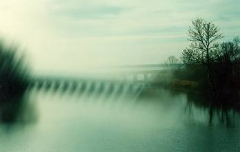
Figure 4 Probably Figure 5 is less debatable. In this photo the bridge and the two virtually empty spaces above and below the bridge form a horizontally symmetrical composition. Nothing above or below the bridge makes either part dominant. However, in this case the effect of competing interests is still much weaker.

 |
|
|
| Built-in Cognitive Rule |
Perhaps this result is due to our built-in perceptual principle that the upper portion of a composition draws our interest first, even in a perfectly symmetrical composition divided by a horizontal line. On the contrary, in the case of vertically symmetrical composition, there is no built-in cognitive rule telling us whether the right or the left is more important.
Some may argue that objects on the left would draw our attention first. This is why newspaper editors put important news or high-priced advertisements in the upper left of the newspaper. It is true only in Western culture where readers read articles from left to right. In Chinese-speaking regions where people read sentences in the opposite direction, editors put big stories in the upper right corner instead. Therefore, the concept that "the left is more important or more interesting than the right" is not universal.
Nevertheless, there is one common ground of the two cultures: The upper part seems to attract more attention. This can explain why the problem of competing interests does not happen in a horizontally symmetrical composition, which has no dominated subject in either portion of the picture. There is a universal cognitive principle driving us to look at the upper portion first.
| Recommendations |
For photographers and artists of other media, the preceding hypothesis has these practical values:
- Avoid a vertically symmetrical composition, but not one that is horizontally symmetrical.
- If you really need to place a tall subject at the center, try to break the balance by introducing another element on either the right or left half. Another way to break the symmetry is to tilt the angel to make the tall subject a diagonal line.
- In a horizontal symmetrical composition, try not to allocate outstanding elements in the lower part. By doing so you may create competing interests because the viewer tends to put more weight on the top.
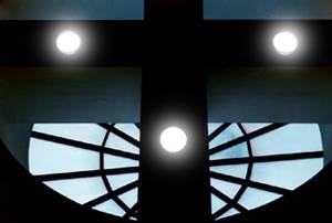
- If you really want the subject or some outstanding element reside in the lower part, move the horizontal line up. For example, in Figure 6 the window makes the lower portion bright and eye-catching, therefore the horizontal line of the cross was moved up.
 |
|
|
| Conclusion |
In physics "symmetry breaking" is crucial to "phase transition" of physical materials. Whenever water transitions to another phase, such as snow or steam, the symmetry of the original water content in the subatomic level is broken. If not for broken symmetry, things would remain status quo and the world would be uninteresting. This analogy from the physical world could illuminate our understanding of the perceptual/psychological world. In short, if you want to produce an interesting picture, break the symmetry!
Navigation
Index
Simplified
Navigation
Table
of Contents
Search
Engine
Contact