The Visualization of Multi-way Interactions and Higher-order Terms in Multiple Regression
John T. Behrens and Yu, Chong Ho
Paper presented at the 1994 meeting of the Psychometric Society
	Exploratory Procedures
		Conditioning Plots
		Scatterplot-brushing
	Aiken and West procedure
	Extending the Aiken and West procedures
	Visualization for the masses
	Summary/Conclusion
	References
Abstract
Whereas multiple regression is generally preferred over Analysis of Variance when examining continuous independent variables (e.g. Maxwell and Delaney, 1993), Aiken and West (1991) concluded that use of multiple-regression with appropriate interaction terms or higher-order terms remains rare. Citing difficulty in interpreting the results of such analyses as a possible reason for this practice, Aiken and West presented a number of graphical techniques to depict multiple regression slopes with significant interaction- and higher-order terms. The graphics suggested by Aiken and West benefit from computational simplicity and interpretation analogous to line-plots of ANOVA cell means, yet fail to communicate the continuous nature of the functions involved. We extend the work of these authors by demonstrating the visualization of surfaces implied by two- and three-way interactions. Two-way interactions are depicted as three-dimensional surfaces while three-way interactions are depicted using animation of two-way interactions changing over time. Extension to squared and cubic terms is straightforward. Issues concerning the appropriateness of animation and the use of color to reinforce or extend the perception of dimensionality is discussed.
The Visualization of Multi-way Interactions and Higher-order Terms in Multiple Regression
Multiple-regression (MR) is a flexible data analytic tool that can be appropriately applied to a wide range of problems involving independent variables that are either discrete or continuous. Nevertheless, problems that are quite appropriately addressed using the MR framework are often reconceptualized and recoded to fit the more common Analysis of Variance (ANOVA) approach based solely on discrete independent variables. While relatively common, this generally leads to less power for the main effects tests and under some conditions inflates Type I error for interaction terms (Maxwell and Delaney, 1993). Aiken and West (1991)reported that when MR is applied in the case of multiple independent variables interactions are seldom employed.
While a number of reasons for the avoidance of MR and MR models with interactions can be suggested, a common reason cited both in the literature and in conversations we have with applied researchers is that the interpretation of interaction terms is simpler in the ANOVA approach and the meaning of interactions in MR is not clearly understood. Such a state of affairs is to be expected given the common instruction in statistics and research methods that includes early introduction to interaction effects in ANOVA with heavy reliance on interpretation of cell mean plots. This instruction is often matched with a cursory treatment (if any) of the possibility of interaction terms in MR, often with little assistance in interpreting the magnitude and direction of effects.
Because of the importance of interaction terms in psychological research and the negative effects of artificially categorizing continuous data to fit the ANOVA model, we have begun to investigate and develop aids for the visual detection and interpretation of interaction effects in MR. This paper discusses a number of graphic tools which can be used for these purposes. In the first section we discuss scatterplot matrices and conditioning plots as tools for the exploration of possible interaction effects. In a second section, we introduce the methods suggested by Aiken and West for graphical display of the effects and present our extension of their work by using multivariate visualization of the data and regression functions. Further extensions of this work to third-order interactions and higher-order (non-linear) terms is also discussed as are possibilities for extending our approach to other issues in the teaching and interpretation of multiple regression.
Exploratory Procedures
Conditioning Plots
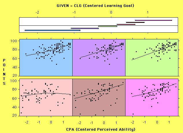
In the ANOVA framework, interactions are often explained as differences between means on one factor that vary across levels of another factor. The MR extension of this definition concerns when slopes relating two variables vary across levels of a third variable (in the case of a second order interaction). To visually detect an interaction, different slopes must be apparent between X and Y at different levels of Z. Accordingly, if Z is broken into a series of intervals, the regression of Y on X in each Z interval can be assessed with an eye open for differences in slope across the series of plots. One way to present a series of scatterplots between X and Y conditional on Z is to use a conditioning plot which was designed for this purpose. A conditioning plot as implemented in the S-plus software is presented in Figure 1.
The scatterplots in the lower portion of the graphic are scatterplots relating two variables (number of points obtained in a class and a scaled value of perceived ability in the domain) conditional on a third variable (self reported degree of learning goal orientation). The top of the graphic is comprised of a scale for learning goal orientation and a series of overlapping lines. Each line represents the range of learning goal which was included in a corresponding scatterplot. The first line reflects the range of the first (upper left) scatterplot, with the second line indicating the range of the next scatterplot and so on. The reader may note that the intervals overlap -- an aspect necessary to maintain the continuous influence of points on the conditional regression slope. Because the degree of overlap reflects the degree of local conditionalization for each scatterplot, this aspect of the plot is modifiable in the S-Plus (Statistical Sciences, 1993) implementation. The length of the conditioning intervals also varies because they reflect the density of points in different regions of the multidimensional space.
The example presented in Figure 1 shows how the slope relating points and perceived ability fluctuates toward zero in the middle of the learning goal dimension while exhibiting positive slope elsewhere. Such a pattern would not be self-evident in examination of simple marginal distributions or unconditionalized scatterplots.
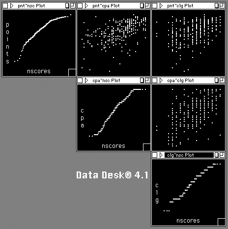
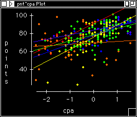
While the conditioning plot can show the X-Y relation conditional on Z, in some cases more variables are involved or more control is desired for exploring regression interactions. When this is the case brushing a linked scatterplot matrix is often helpful. A scatterplot matrix is a collection of scatterplots organized in a matrix analogous to a correlation matrix. An example of such a plot is presented in Figure 2 which depicts a matrix implemented in DataDesk (Velleman, 1992).
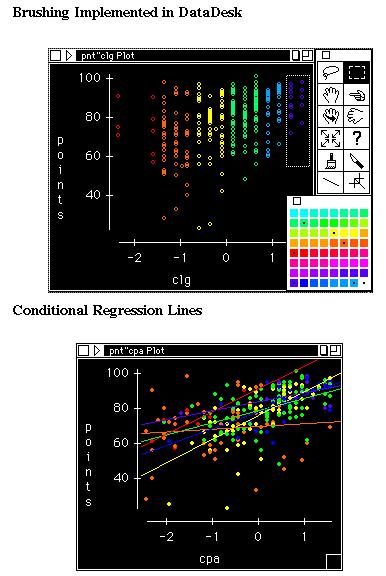
The diagonals of scatterplots usually contain univariate plots such as histograms, density functions, or as seen here, normal-probability plots. Scatterplot matrices designed for exploratory data analysis are usually linked. Linked plots are indexed so that alteration of an observation on one plot leads to the same alteration of the case on all other linked plots. For example, in Figure 3 a number of cases which have low values of learning goal are highlighted (brushed) and turned red by touching the color palette. Because the plots are linked, all instances of those cases are made red in the linked plots.
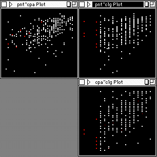
Figure 4 depicts the brushing and coloring of a subsequent set of cases in the learning goal dimension and the corresponding indication in the other plots. By differentially coloring cases along one scale (in this case the learning goal scale) the values along this scale can be perceived in other bivariate plots which do not include this variable on the axes.
DataDesk has a built in function for producing colored regression lines as shown in Figure 5. Here it can be seen that the regression line for orange cases (those that are at the center of the learning goal scale) is relatively flat while the regression lines are otherwise positive. This is the same impression obtained by viewing the conditioning plot discussed above.
The scatterplot matrix illustrated here contains only 3 variables. In analyses where more variables are to be explored concurrently, the brushing of one variable and the addition of colored (conditional) regression lines across a large number of plots can allow the quick assessment of possible interactions in a large number of dimensions.
Clearly the exploratory mode of such analyses leads to sets of possibilities and should not be confused with the results of confirmatory data analysis. It is also important to note that the colors cannot overlap since each case must be of one color or another. In this analysis the number of color categories and the width of the categories is arbitrary and several coloring schemes should be attempted to insure the slopes are not simply artifacts of an unusual grouping scheme.
Interpreting Confirmatory Analyses
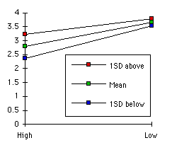
The procedures described above are valuable aids for seeking interaction patterns in multivariate data and for illustrating the concept in instructional settings. When an appropriate regression function is fit to data, interpreting the size and direction of the effect is not always straightforward. Aiken and West (1991) recommended plotting regression slopes by identifying predicted points in Y at levels of X and Z. For example, using data relating amount of student self regulation, perceived ability, and learning goal orientation (taken from Miller, 1994) we computed the predicted values for in self regulation for points one standard deviation above and below the mean of perceived ability at points one standard deviation above the mean, at the mean, and below the mean of learning goal measure. Lines connecting these points indicate the conditional slopes relating perceived ability and self-regulation conditional on learning goal strength, as shown in Figure 6.
Following the recommendations of Aiken and West (1991) and a number of other authors (e.g. Jaccard, Wan & Turrisi, 1990), we employed centered scores for the independent variables used in the interaction terms.
This procedure provides straightforward interpretation of the interaction term and can be computed by hand. It can also be extended to third-order interactions in which the slopes of these three lines (representing the second-order interaction) are redrawn for their appropriate values one standard deviation above and below the mean of the third predictor. Such a set of two plots would show how sets of slopes (such as the one presented here) may themselves be conditional their location along another dimension. Aiken and West (1991) describe methods for drawing the curved regression lines which follow from higher-order terms.
While this procedure represents an appropriate and widely-available method to facilitate interpretation of regression interactions, there are several points at which it may be improved with appropriate computational tools. First, the lines are depicted apart from the data and thereby give little information about the relation between the idealized function and the raw data. A valuable extension of their approach would allow the visualization of the lines in the context of the raw data. Second, the use of a small discrete number of regression lines facilitates computation but fails to depict either the continuous nature of the function or the relative depth of each conditional slope in the Z dimension. The plotting of the regression lines at each value of Z, rather than at three points, would provide a regression surface indicative of the continuous nature of the regression function. Finally, the depiction of three-way interactions is sometimes difficult to interpret since six lines are used to describe a surface in four variables. At the very least, it is sometimes difficult to envision the shape of the functions between the endpoints of the dimensions used.
Extending the Aiken and West procedures
In light of the analysis presented above, we set out to produce visualizations of multiple-regression interactions that more realistically depicted the multi-dimensional structure of the data while illustrating the continuous nature of the regression function and providing extension of the methods to three-way and higher interactions and higher-order terms.
Our primary tool in this work has been the three-dimensional graphic structure available in Mathematica. Data can be organized as a three-d object which can be visualized using a number of built-in plotting functions. For example, returning to the data depicting the relation between self-regulation and perceived ability as moderated by learning goal level, the raw data for the first two variables are presented in the first frame of Movie 1. The first frame appears to be a bivariate scatterplot but is actually a perspective-correct depiction of a three-dimensional cube with the axes for the learning goal dimension omitted. The subsequent frames show the same data vectors portrayed with the conditional regression lines overlaid and the axes for the third dimension added.
As we noted above, the plotting of individual lines can be extended following the regression analogy of continuous data until a series of conditional lines are drawn and connected to represent the regression surface obtained from a second-order interaction. Such a surface is depicted imbedded in its raw data in Figure 8a and with the data removed in Figure 8b.
These surfaces are a straightforward extension of the ideas presented by Aiken and West and, we believe, greatly facilitate the interpretation of the interaction terms. The three-dimensional nature of these graphic objects allows the data analyst to view the function from any position. For presentation purposes the cube could be visualized as rotating by rendering the image of the cube in a sequence of positions that simulated motion. The graphics can then be combined and stored as a Quick-time movie which can be played to show rotation. Such a rotation would allow the data analyst to view the function from a number of positions which is sometimes need when parts of the surface are hidden from view if only a single viewpoint is given.
The combination of the data and the surface also presents some interesting, and as yet unexplored, possibilities. For example, plots of indicating high leverage points could be produced with corresponding indication in the three-dimensional representation (in a non-interactive form of brushing). Residuals could likewise be produced in multiple dimensions to communicate the bivariate structure of residuals in the MR context.
Another advantage of the surface visualization we are employing is that it is easily extended to third-order interactions. As stated above a second-order interaction can be depicted by a series of slopes relating X and Y which vary along Z and can be thought of as forming a surface. A third-order interaction can be explained by showing a second-order interaction which differs according to different levels of the third independent variable. In our scheme, this entails rendering a different regression surface at each level of the third variable and combining the sequence of drawings into a Quicktime movie. When the movie is played, the surface changes over time as the player moves through the series of conditional surfaces. In this way, time serves to indicate the fourth dimension. Indexing is accomplished by including the value of the fourth dimension in the title of each picture. An example of a three frames taken from a Quicktime movie of a third order interaction is presented in Figures 9a, b and c. Of course, the inclusion of non-linear terms is non-problematic for this process.
The visualizations described above require more knowledge of Mathematica (or some other high-level mathematics language such as Maple) than the average applied research has time or interest for. To empower the graduate students and faculty we work with (and to reduce our own work load) we have developed a HyperCard front end which facilitates the construction of simple visualizations. The program prompts the user to enter descriptive information concerning the variables involved in the regression analysis and then prompts the user to enter appropriate regression slope estimates obtained through their own previous analysis. After this information is entered the program writes appropriate Mathematica code and prompts the user to paste it into the Mathematica program where it is evaluated to produce the desired graphic or movie. Development of a near 'idiot proof' version of the front end is now underway. Based on the AppleScript scripting language, future version of the program should allow production of the visualizations without the user having any awareness that Mathematica is the computational engine.
This paper reported on several methods to visualize interactions in MR. Exploratory procedures of conditioning plots and brushing scatterplot matrices were discussed and illustrated. The procedures recommended by Aiken and West (1991) for interpreting regression formulas was discussed along with improvements for the visualization of these functions based on three-d graphic objects easily manipulated in programs such as Mathematica. Third-order interactions were shown to be easily visualized as series of second-order interaction surfaces which are rendered conditionally on the value of the third independent variable. By combining the series of graphics into a QuickTime movie, the visualizations are portable, easily controlled, and easily interpreted.
For copies of the graphics or movies which accompany this paper please contact the authors at the address given on the cover page.
Statistical Sciences (1993). S-PLUS for Windows. Seattle Washington: Statistical Sciences.
Velleman, P. F. (1992). DataDesk Handbook. Ithaca, NY: Data Description Inc.
Navigation
Simplified Navigation

Press this icon to contact Dr. Yu via various channels