Since the term "scientific visualization" was coined by a panel of the Association for Computing Machinery (ACM) in 1987 (McCormick, DeFanit, & Brown, 1987), both hardware and software developers have invested resources to enhance computer graphing capabilities. These developments can be seen as a logical extension of the work of John Tukey (1977, 1980, 1986a, 1986b, 1986c, 1988), who argued for the value of high dimensional graphics in social sciences.
While many scientific researchers believe that dynamic visualization is a promising data analysis tool for a variety of applications (e.g. Alexander & Winarsky, 1989), psychological studies concerning advanced graphical representation have been unable to support the effectiveness of these displays (Marchak & Whitney, 1990; Marchak & Marchak, 1991; Wickens, Merwin, & Lin, 1994). To address this discrepancy, this paper suggests a alignment framework to explain these different opinions, and proposes and reports the results of an empirical test of this explanation. The central thesis of this work is that visualization is only effective when there is an appropriate alignment of data type, task type (research goal) and type of graphical representation.
Among such researchers in the field of visualization, C. Wickens and his colleagues have established one of the most theoretically grounded and programmatic research endeavors (cf. Wickens, 1986; Carswell & Wickens 1987; Barnett & Wickens, 1988, Wickens, Todd, 1990; Goettl & Wickens & Kramer, 1991; Wickens, 1992; Wickens, Merwin & Lin, 1994). Building on his theory of the proximity compatibility principle, Carswell and Wickens (1987) predicted that integral displays are suited for integrative tasks while separable displays facilitate focus tasks. An integral display combines several dimensions in a single object whereas separable displays show data of different dimensions in different panels.
However, in several empirical studies this prediction was not fulfilled. Wickens interpreted these results as a failure of high-dimensional graphical devices in general. In this paper I argue that Wickens' negative results are not due to the general ineffectiveness of visualization procedures, but rather to the misalignment of data type, research goal (task type) and graphical type employed in his research. The supposition of this paper is that the quality of graphical display is dependent on the proper alignment of these three aspects of data visualization, as introduced in the following section.
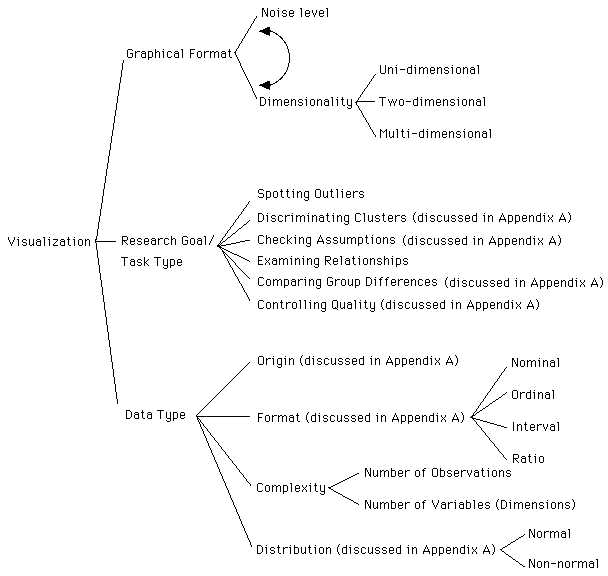
Figure 1. Taxonomy of three aspects of visualization
Taxonomy of Visualization Techniques
To make sense out of different graphical representations one can consider them in terms of dimensionality and noise-smooth (Yu & Behrens, 1995). As shown in Figure 2, visualization techniques can be considered to fall somewhere between two poles of the noise-smooth continuum, as well as the level of dimension. Noise level and dimensionality together dictate the complexity of the graph.
                                     One-dimensional
                                            |
                                            |
                                            |
                                     Two-dimensional
                                            |
                                            |
                                            |
               Noise--------------------------------------------------Smooth
                                            |
                                            |
                                            |
                                    Multi-dimensional
Figure 2. Noise-smooth continuum and level of dimensionality
The level of data dimension conditions the choice of graphing technique. For instance, a single histogram is often an effective summary of one-dimensional data (Scott, 1992). With bivariate data a scatterplot is a logical candidate for visualization because histograms cannot depict bivariate functions. Multivariate data sets usually require even more sophisticated visualization techniques.
In short, this taxonomy of visualization technique guides the researcher to contemplate questions such as "how many dimensions do I want to display?" "Should I reduce or integrate several dimensions?" Decisions about dimension reduction are often driven by the research goal and data type, which are discussed below.
In contrast to the above taxonomy, Wickens et al. (1990, 1994) classified task type in terms of the degree of information integration. However, his categorization is of little practical use because pure focus and medium integration tasks such as reporting data values are seldom used in data visualization, and his high integration tasks emphasize on individual observations. This will be more fully discussed below in the section regarding Wickens' research.
Data complexity is governed by the level of dimension, the number of observations, and the structure of the data. The need for dimension integration and noise filtering in graphics arise from the complexity of data sets. If all data sets are one-dimensional, contain as little as six to eight observations, and provide a nicely bell-shaped curve or a linear function, there will be little struggle between noisy and smooth displays. However, when the data set is multi-dimensional, contains hundreds or even thousands of observations, has non-normal distributions and non-linear relationships among variables, advanced visualization techniques should be used to deal with all three sources of data complexity.
If different physical dimensions in a graph correspond to a single cognitive code, a graph is considered integral. A successful collection of dimensions would bring out an emergent feature that facilitates data analysis. However, occasionally these dimensions may be too artificial to be blended mentally. In such cases a graph that maintains separate perceptual codes in different dimensions is said to be configural (Carswell & Wickens, 1990).
Wickens and his colleagues conducted a series of experiments to verify these predictions. Throughout these experiments, the proximity compatibility principle was only partially supported. In a recent study aimed at simulating scientific visualization, Wickens, Merwin and Lin (1994) found that certain integral displays were not more supportive than separable ones in integrative analysis. This study consisted of two experiments. The first one was a comparison between 2D (separable) and 3D (integral) displays with six data points on each graph whereas the second one examined the effectiveness of stereo, mesh and rotation with eight data points on each graph. While the first experiment was similar to Wickens et al.'s previous studies, the second one carried new aspects of greater consequence. In the second experiment, three types of display were employed--stereopsis, 3D plot with the feature of rotation, 3D plot with a mesh surface. A still 3D plot was used as the control condition. The task types were also classified in terms of the degree of information integration:
1. Pure focus task, e.g. What is the earnings value of the blue company?
2. Integration across dimensions in one observation, e.g. Is the green company's debt value greater than its earnings value?
3. Integration across observations in one dimension, e.g. How much greater is blue's price than red's price?
4. Integration across dimensions and observations, e.g. Which company has the highest total value of all three variables?
It was found that the long term retention of abstract knowledge of the data failed to benefit from the 3D display exposure. Also, the rotation of a 3D graph and the presence of a mesh surface did not support performance in integrative processing. Wickens et al. stated that "it is an article of faith in many scientific visualization products that scientists should be able to explore their data interactively" (p.47) while in their empirical study animated motion did not provide any benefit for understanding data.
It is doubtful whether focus tasks and medium integration tasks should be implemented with visualization at all. For instance, in the study reported above (Wickens, Merwin & Lin ,1994) the focus question is: "What is the earning value of the blue company?" This question can be easily answered by simply looking up the values on a spreadsheet. Even in the supposed high integration task, the focus is still on individual values rather than the relationships among variables: "Which company has the highest total value of all three variables?" Indeed it is more efficient to sum the values of all three variables, sort the data by summed values, and then list all the cases.
Although a 3D spin plot can be used for closely examining particular observations such as detecting outliers, the major concern of spotting outliers is the relative distance between the extreme cases and the majority of the observations. In other words, the analyst cares more about the overall data structure than individual cases. However, in Wickens et al.'s experiment, the focus on individual observations led subjects away from the global picture. Accordingly, the graphical format of the 3D spin plot and the task type of value-reporting are misaligned and poor performance should be expected.
Similar concerns arise when Wickens employed the 3D mesh. A 3D mesh is usually a smoothed surface. However, in Wickens et al.'s graph only individual data points are connected. It is qualified to be a surface plot or a perspective plot, rather than a mesh plot. A surface plot is not appropriate for aiding data value reporting, because in a large data set the surface would appear to be rough and tracing the exact co-ordinate is difficult. Even in a small data sets as Wickens et al. portrayed, exact co-ordinates are difficult to perceive. Again, Wickens et al.'s experiment tasks represent a misalignment of research goal and graphing technique.
Tasks given in Wickens et al.'s experiments, ranging from pure focus to so-called high integration, are not compatible with the goal of pattern seeking in data visualization. Given all the preceding misalignments, it is not surprising that Wickens et al. found no advantage of 3D spin and 3D mesh, because they are the wrong tools for the assignments that concentrate on individual values.
For example, in the experiment discussed above, Wickens reported no advantage for use of a 3D plot. This is not unexpected under the circumstances described by Wickens, because 3D plots were developed primarily to solve the problem of overplotting and perspective limitation in multiple dimensions. In this case of small sample size, no overplotting and viewpoint obstruction occured and the advantages of the 3D plot could not be gained. In this way Wickens' tasks represent a misalignment of the plot made for high volume data with a very small data set.
The size of the data set is also an issue determining the appropriate use of a mesh surface. When there are many observations in a 3D plot, the perception of trend, which is based upon our perception of depth, is not easily formed. In this case connecting neighboring points to construct a mesh surface is helpful because it can provides depth cues. Moreover, if there are many peaks and holes in the plot, a smoothed mesh surface derived from a function is also desirable. In the third study reported above Wickens et al. (1994) found no advantage to this plot, but again, they had not properly aligned the plot with the type of data set size appropriate for the plot. An advantage of the type Wickens might have expected is only likely to occur when the size of the data set is large--an attribute that did not hold when only eight data points were used.
Each data set was displayed using three types of graphs on Macintosh computers. These graph type were: (a) A set of 2D scatterplots portraying three variables in a pairwise manner, (b) a 3D plot portraying a cloud of data points with a spin option, (c) a 3D plot with a mesh surface conforming to the underlying function is shown in Figure 3.
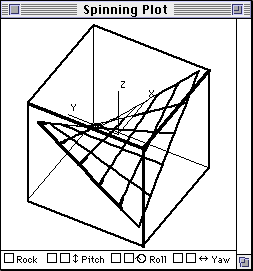
Figure 3. 3D mesh plot
In this experiment I will refer to a combination of graph(s) and question as a scenario. Subjects were exposed to all eighteen scenarios as described in the design section. In order to avoid carry over effects, the data used in each scenario were randomly drawn from data sets. The order of scenarios was likewise randomized for each individual.
For each scenario, subjects viewed a graph or several graphs, and a dialog box with a multiple-choice question. They were told to answer the question according to the information shown on the graph(s), and were permitted to manipulate the graphics as appropriate to the graph type. After an answer was selected, another set of graph(s) and problem were presented. The process ended when all eighteen conditions were exhausted. The subjects were allowed to explore the data and answer the online question for about thirty minutes. Afterwards, they repeated the same procedure with a different sequence of the scenarios and different data sets drawn randomly.
For the task of examining relationship, participants were given values of two variables and asked for a third. Again, the subjects had three choices: high, medium, and low.
Table 1
Repeated Measures ANOVA for Outlier Detection
                                Univariate
Source              df1  df2    MSe             F             p
Graph Type            2  44     .1280           36.78         .0001
Data Size             2  44     .0984           1.14          .3287
Graph * Data          4  88     .1030           4.55          .0022
                                Multivariate
Source              df1  df2    MSe             F             p
Graph Type            2  21                            33.12  .0001
Data Size             2  21                             1.05  .3634
Graph * Data          4  19                             3.15  .0380
A logistic regression with exact test using Test 1 scores found a significant graph effect for the medium sample size and the large sample size. However, no significant graph effect was found for the small data size. Exact tests using Test 2 scores yielded significant results across all three sample sizes. Summary of exact tests are reported in Table 2.
Table 2
Results of Exact Tests for Outlier Detection
Sample size                     p
            Test 1
Small                       .1104
Medium                      .0011
Large                       .0004
            Test 2
Small                       .0186
Medium                      .0037
Large                       .0001
The confidence intervals of proportion regarding outlier detection are shown in Figure 4. Patterns of Test 1 and 2 were slightly different. For the small sample size of Test 1, the confidence bands of three types of graphs overlapped, and are not distinguishable in terms of performance. For the small data size of Test 2, however, 3D mesh plots were superior to 2D scattergrams. For the medium data size of Test 1, 3D spin plots were superior to 2D plots. Nonetheless, for the medium data size of Test 2, performance difference between 3D spin plots and 2D graphs were trivial.
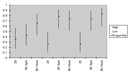
a. Test 1
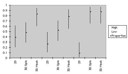
small medium large
b. Test 2
Figure 4. Confidence intervals of graphs for outlier detection
Table 3
Repeated Measures ANOVA for Relationship Examination
                                Univariate
Source              df1    df2             MSe             F           p
Graph Type            2     44           .1290         32.69       .0001
Data Size             2     44           .0883         16.37       .0001
Graph * Data          4     88           .1092          4.08       .0051
                                Multivariate
Source              df1    df2                             F           p
Graph Type            2     21                         37.99       .0001
Data Size             2     21                         11.26       .0005
Graph * Data          4  19                     8.93          .0003
Exact tests reported here, which were stratified by subjects, were analogous to those of repeated measures ANOVA. In both Test 1 and 2 significant results were found in small and medium sample sizes. However, in the large sample size of both tests the three graphical formats did not differ from each other. Summary of exact tests are reported in Table 4.
Table 4
Results of Exact Tests for Relationship Examination
Sample size                     p
            Test 1
Small                      .00001
Medium                     .00250
Large                      .38970
            Test 2
Small                      .00010
Medium                     .00010
Large                      .17030
As shown in Figure 5, confidence intervals of proportion pertaining to relationship examination resemble those of repeated measures ANOVA. Here differences in effectiveness of graph type were congruent with those illustrated in Figure 5a. In the medium data size of Test 1, variation of performance using 3D spin plots and 2D graphs were indistinguishable. This pattern did not hold in Test 2, in which 3D spin plots had an advantage over 2D plots.
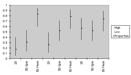
small medium large
a. Test 1
small medium large
b. Test 2
Figure 5. Confidence intervals of graphs for relationship examination
Scores of Test 1 and 2 were computed separately for confidence intervals. In the small sample size of Test 1, performance among the three types of graph were indistinguishable. In the medium sample size performance of 3D spin was even better than that of 3D mesh plots. However, in Test 2 3D mesh plots led to superior performance than 2D plots in both small and medium sample sizes. Also, in the small data size of Test 2 the difference between 3D spin and 3D mesh plot approached significance. Further, in the medium data size of Test 2 the relationship between 3D spin and 3D mesh plots was opposite to that in Test 1 i.e. 3D mesh plot outperformed 3D spin plot. This is consistent with the idea that students improved their skill for interpreting 3D mesh plots after some practice.
It was found that virtually in all sizes of data sets, performance improved as the sample size increased. The exception is that in 2D plots scores of small and medium sample sizes were exactly equal. One explanation is that the large data set provided enough observations to form a more obvious function while the small and medium data sets failed to suggest a pattern.
It is interesting to notice that in both outlier detection and relationship examination, sample size did not make a significant difference in 3D mesh. However, the large data set was still the best, the medium, the second, and the small, the worst. It is concluded that regardless of sample size, a mesh surface was helpful in examining relationships among variables and also detecting multiple outliers.
Most of the findings in this study confirm the notion that the usefulness of visualization technique is tied to the task nature and the data type. Although the effectiveness of 3D mesh in the small data set was not foreseen, this result further supports the alignment framework rather than weakening it. At first it was argued that the ineffectiveness of 3D graphics in Wickens et al.'s studies (1994) is due to the use of a few observations on the graphs. However, this study counteracted Wickens' conclusion because even with a small data set 3D graphics are still superior to 2D ones.
Barfield, W., & Robless, R. (1989). The effects of two- or three-dimensional grphics on problem-solving performance of experienced and novice decision makers. Behavvior and information Technology, 8, 369-385.
Barnett, B., & Wickens, C. (1988). Display proximity in multicue information integration: The benefits of boxes. Human Factors, 30, 15-24.
Carswell, M., & Wickens, C. D. (1987). Information integration and the object display: An interaction of task demands and display superiority. Ergonomics, 30, 511-527.
Carswell, M., & Wickens, C. D. (1990). The perceptual interaction of graphical attributes: Configurality, stimulus homogeneity, and object integration. Perception and Psychophysics, 47, 157-168.
Casey, E. J., & Wickens, C. D. (1986). Visual display rep[resentation of multidimensional systems (Tech. Report ARL-90-5/AHEL-90-1). Savoy, IL: University of Illinois Willard Airport, Aviation Research Laboratory, Institute of Aviation.
Goettl, B. P., Wickens, C. D., & Kramer, A. F. (1991). Integrated displays and the perception of graphical data. Ergonomics, 34, 1047-1063.
Kosslyn, S. M. (1994). Elements of graph design. New York: W. H. Freeman Company.
Lee, J. M., & MacLachlan, J. (1986). The effects of 3D imagery on managerial data interpretation. Management Information Systems Quarterly, 10, 257-269.
Marchak, F. M., & Marchak, L. C. (1990). Dynamic graphics in the exploratory analysis of multivariate data. Behavior Research Methods, Instruments, & Computers, 22, 176-178.
Marchak, F. M., & Marchak, L. C. (1991). Interactive verus passive dynamics and the exploratory analysis of multivartiate data. Behavior Research Methods, Instruments, & Computers, 23, 296-360.
McCormick, B. H., DeFanti, T. A., & brown, M. D. (Eds.). (1987). Visualization in scientific computing [Special issue]. Computer Graphics, 21(6).
Palya, W. (1991). Laser printers as powerful tools for the scientific visualization of behavior. behavior Research Methods, Instrument, & Computers, 23, 277-282.
Scott, D. W. (1992). Multivariate density estimation: Theory, practice, and visualization. New York: John, Wiley & Sons.
Spence, I. (1990). Visual psychophysics of simple garphical elements. Journal of Experimental Psychology: Human Perception and Performance, 16, 683-692.
Tukey, J. W. (1977). Exploratory data analysis. Reading, MA: Addison-Wesley Publishing Company.
Tukey, J. W. (1980). We need both exploratory and confirmatory. The American Statistician, 34, 23-25.
Tukey, J. W. (1986a). Data analysis and behavioral science or learning to bear the quantitative man's burden by shunning badmandments. In L. V. Jones (Ed.), The collected works of John W. Tukey, Volume III: Philosophy and principles of data analysis: 1949-1964. Pacific Grove, CA: Wadsworth.
Tukey, J. W. (1986b). The collected works of John W. Tukey, Volume III: Philosophy and principles of data analysis: 1949-1964. L. V. Jones (Ed.). Pacific Grove, CA: Wadsworth.
Tukey, J. W. (1986c). The collected works of John W. Tukey, Volume IV: Philosophy and principles of data analysis (1965-1986). L. V. Jones, (Ed.). Pacific Grove, CA: Wadsworth.
Tukey, J. W. (1988). The collected works of John W. Tukey, Volume V: Graphics. W. S. Cleveland, (Ed.). Pacific Grove, CA: Wadsworth.
Ware, C., & Beatty, J. C. (1986). Using color to display structures in multidimensional discrete data. Color and Resereach Application, 11, S11-14.
Watson, C. J., & Driver, R. W. (1983). The influence of computer graphics on the recall of information. Management Information Systems Quarterly, 7, 45-53.
Wickens, C. D. (1986). The object display: Principles and a review of experimental findings (Tech. Report CPL-86-6/MDA903-83-K-0255). Champaign, IL: University of Illinois, Cognitive Psychphysiology Laboratory.
Wickens, C. D. (1992). Engineering psychology and human performance (2rd ed.). New York: Harper Collins Publisher.
Wichens, C. D., & Todd, S. (1990). Three-dimensional display technology for aerospace and visualization. In Proceedings of the Human Factor Society 34th Annual Meeting (pp.1479-1483). Santa Monica, CA: Human Factors and Ergonomics Society.
Wickens, C. D., Merwin, D. H., & Lin, E. L. (1994). Implications of graphics enhancements for the visualization of scientific data: Dimensional integrity, stereopsis, motion, and mesh. Human Factors, 36, 44-61.
Yorchak, J. P., Allison, J. E., & Dodd, V. S. (1984). A new tilt on computer generated space situation displays. In Proceedings of the Human factors Society 28th Annual Meeting. Santa Monica, CA: Human Factors Society, 894-898.
Yu, C. H., & Behrens, J. T. (1995). Applications of scientific multivariate visualization to behavioral sciences. Behavior Research Methods, Instruments, and Computers, 27, 264-271.