Using
SAS/Graph
to
Visualize Distractor
Analysis
Chong Ho Yu, Ph.D.
|
In
multiple-choice items, it is desirable to insert plausible
distractors (wrong answers) in order to increase the item
difficulty level. According to the Item Response Theory, students
who master the subject matter and belong to high theta groups
(above zero) should have a higher probability to select the right
answer, and a lower probability to choose the wrong options. In
contrast, examinees who belong to low theta groups (below zero)
should show the opposite pattern. The following SAS plot helps the
instructor to visualize whether distractors and the right answer
behave in this manner.
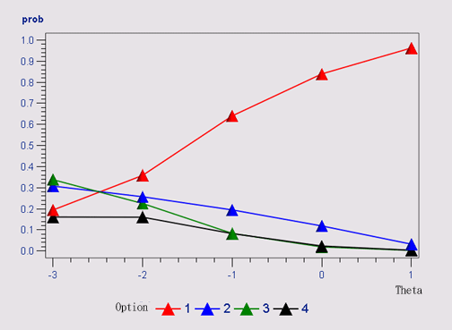
In this example, the right answer is Option 1. Students
who do not possess the knowledge required for answering this
question fail to select Option 1, and students who master the
domain knowledge tend to choose the correct answer. Nonetheless,
this item seems to an easy question, because even an average
student (theta = 0) has .84 probability to answer the question
correctly.
It is important to note that this probability is conditional on
theta. To be specific, it is derived from the ratio between the
number of subjects in the same theta level who chose a particular
option and the number of all subjects who belong to the same theta
level.
|
|
|
Table
of q24 by theta
|
|
q24
|
theta
|
Total
|
|
-3
|
-2
|
-1
|
0
|
1
|
|
1
|
70
19.39
|
2215
35.82
|
27786
64.05
|
62025
83.97
|
66392
96.28
|
158488
|
|
2
|
111
30.75
|
1588
25.68
|
8436
19.45
|
8744
11.84
|
2197
3.19
|
21076
|
|
3
|
122
33.80
|
1391
22.50
|
3600
8.30
|
1383
1.87
|
152
0.22
|
6648
|
|
4
|
58
16.07
|
989
16.00
|
3560
8.21
|
1715
2.32
|
215
0.31
|
6537
|
|
Total
|
361
|
6183
|
43382
|
73867
|
68956
|
192749
|
|
For example, there are
361 students in the group of
theta = -3. Among these 361 students,
70 of them selected Option 1.
Thus, the conditional probability is the column percentage =
70/361
= .19. (SAS converts the
probability to percentage .19 = 19.39%). Prob(option=1|theta=-3)
+ Prob(option=2|theta=-3) + Prob(option=3|theta=-3) +
Prob(option=4|theta=-3) should be equal to one. The same
principle is applied to the conditional probabilty of other theta
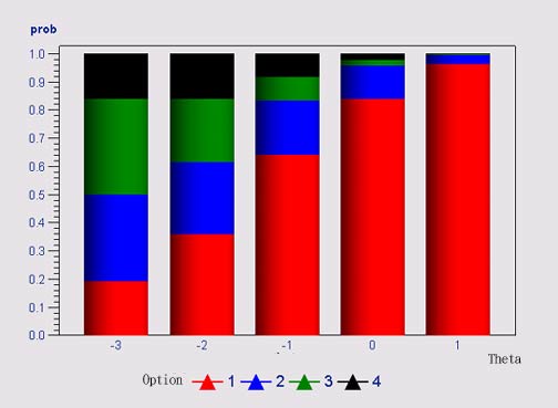
levels. If the line plot is transformed into a stacked bar graph,
all bars should have equal height and occupy the entire vertical
axis, as shown in the following graph:
The following source code is used to visualize the
frequency table in SAS/Graph:
/* output the graph in a webpage using Output Delivery System */
ods
html
file="distract.html";
/* set the
graphical options */
goptions
device=activex;
axis1
order=(0
to 1
by .1);
symbol1
i=join
c=red
width=2;
symbol2
i=join
c=blue
width=2;
symbol3
i=join
c=green
width=2;
symbol4
i=join
c=black
width=2;
/* Round
off the theta value to integers */
data
new; set
theta;
theta = round(t2);
title
"Distractor
analysis";
/* Output
the frequency count */
proc
freq
data=new;
tables
item1 * theta /nopercent
norow
out=t;
proc
sort;
by
theta;
/* Sum the
frequency count by theta */
proc
summary
data=t;
var
count; class
theta; output
out=tb
sum=sum;
/* Merge
the proc summary and proc freq output, compute the conditional prob */
data
tmp; merge
t tb; by
theta;
if
_type_ = 0
then
delete;
prob = (count/sum);
/* Plot the
data */
proc
gplot;
plot
prob*theta = item1 / vaxis=axis1;
run;
ods
html
close;
quit;
|
These procedures are explained in the following:
- Use a software program for Item Response Theory (e.g. Bilog,
Bilog MG) to estimate the theta for each subject.
- Merge the theta and the item responses into one file. Round
off the value of the theta to be integers.
- In SAS use PROC FREQ to output the frequency table.
Please notice that the output from PROC FREQ includes the data of
frequency and total percentage, but not row percentage or column
percentage.
- Use PROC SUMMARY to obtain the number of observations
by theta.
- Merge the output from PROC FREQ and the output from PROC
SUMMARY, then compute the conditional probability.
- Use SAS/Graph to plot the distractor analysis and output the
graph as an ActiveX object, an Java object, or a GIF image.
The preceding graphic is a still GIF image, which disallows
user manipulation. On the contrary, Active X and Java objects are
interactive. For example, in the Web browser the user can change
the chart type from line chart to stacked bar chart to check
whether the conditional probabilities are added to one. Active X
is recommended because it is better-supported by Internet
Explorer. Click here to view an
example of SAS graph generated by Active X . Right click on the graph to explore different dynamic features.
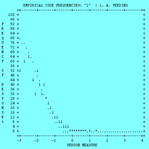
Winsteps could also perform option analysis by showing the
frequency of each option conditional upon the measure (theta), as shown in
the following. But the graph is ASCII-based and each option is shown in a
separate plot. Nonethless, it is a built-in feature of Winsteps, which
requires no programming.
|
Navigation
|