|
Applications of Mutlivariate Visualization to Behavioral Sciences
Chong Ho Yu and John T. Behrens,
Arizona State University
Yu, C. H., & Behrens, J. T. (1995). Applications of scientific multivariate visualization to behavioral sciences. Behavior Research Methods, Instruments, and Computers, 27, 264-271.
Contents
What is Scientific Visualization?
	Visualization as Data Exploration
	Visualization as analogy making
	Visualization as balancing raw data and summary
	Visualization as conceptualization
Noise and Smooth as a Way to Understand Graphics
Variations in Graphics for Visualization
	One dimensional graphs
	Two dimensional graphs
	Multi dimensional graphs
Different Visualization Methods for Multivariate Data
	Stereo-Ray Glyphs
	Volume Model
	Surface plot/Contour plot/Image plot
	Coplot
	Scatterplot-Brushings
	Animated Mesh Surface
Conclusion
References
Widespread availability of desk-top computing allows psychologists to manipulate complex multivariate datasets. While researchers in the physical and engineering sciences have dealt with increasing data complexity by using scientific visualization, researchers in the behavioral sciences have been slower to adopt these tools (Butler, 1993). To address this discrepancy, this paper defines scientific visualization, presents a theoretical framework for understanding visualization, and reviews a number of multivariate visualization techniques in light of this framework.
What is Scientific Visualization?
We define scientific visualization as the process of exploring or displaying data in a manner that builds a visual analogy to the physical world in the service of user insight and learning. Each component of this definition is now addressed.
Visualization as data exploration
While the majority of quantitative training in psychology focuses on confirmatory data analysis , there is a long and well established tradition in statistics called Exploratory Data Analysis (EDA). Pioneered by the work of John Tukey (see especially Tukey, 1977; 1986a, 1986b, 1988), this tradition emphasizes seeking unexpected structure and developing rich descriptions through graphic summary, robust statistics, and model fit indicators. Writing in a tone consonant with this tradition, Cleveland (1993) argued that "visualization is an approach to data analysis that stresses a penetrating look at the structure of data " (p.5). This approach contrasts the common methods of confirmatory analysis that assumes an underlying structure to the data and proceeds with inference on the basis of such assumptions as normality, homogeneity, and independence. While these assumptions are robust in many cases, the assumed and actual structure of the data diverge to the degree these assumptions are violated.
Visualization as analogy making
Physical sciences often build visualization tools based on the analogy of appearance in the physical world. However, no analogy is complete. For instance, when scientists at the Netherlands Research Foundations sought to simulate multi-dimensional phenomena of 3-D flows of fluid dynamics (Hesselink, Post, & Wijk, 1994), they found that was no intuitive or obviously meaningful method to visualize 3D flows of fluid dynamics. Even though a single vector can be represented by an arrow, no compelling physical metaphor exists for a field of vectors. When scientists want to simulate a tensor, the product of vectors, the problem is even more severe. No wonder Keller and Keller (1993) argued that in scientific visualization "choosing techniques to represent the phenomenon may require some creative or artistic talent, especially if the phenomenon is abstract or has never seen, such as the inside of a proton, or a black hole" (p.12).
When working with data from the psychological sciences, the difficulty of extending to physical analogy may be even more pronounced. When working with data from the psychological sciences, the difficulty of extending to physical analogy may be even more pronounced. Though visualization of abstract psychological constructs may not be able to rely on the physical analogy of color or movement to indicate physical color or movement, these attributes can be used to indicate aspects of conceptual difference. For example, the common scatterplot uses physical position in two-dimensional space to indicate magnitude of a measure. The scatterplot works because the physical space of the plot serves as an analogy for the conceptual or measurement space in which an observation is considered to lie. The regression line in simple linear regression, or the plane in multiple regression, is likewise interpretable based on the analogy of the running mean in multi-dimensional test space. Nevertheless, all visualization is based on analogy in one form or another and there is no reason that visual analogy cannot be employed in psychological research.
Visualization as balancing raw data and summary
Data analysis is a process of reducing large amounts of information to parsimonious summaries while remaining accurate in the description of the total data.. This often requires a balancing act between presenting masses of data that may be incomprehensible to the viewer, or presenting summaries that average over too many details of the original data. Visualization seeks to meet this challenge by portraying complex data in interpretable means so that aspects of both the messiness and smoothness of data can be discerned.
Visualization as conceptualization
Visualization is an extension of the conceptual processes of research at two points. First, in the construction of a visualization, conceptualization of the phenomenon must occur by the researcher. The choice of variables, the choice of visualization technique, the choice of angle or color -- all are aspects of the researcher's conceptualization of the problem. As Brooks (1993) said, "The right visualization depends upon what question one is asking." (p.2)
Visualization is also a conceptual process for the viewer of a visualization image. While the image itself may allow parsimonious storage of information about the phenomenon through iconic memory, intra- and inter-personal communication about the phenomenon depicted is most likely to be proposition based. This means that the viewer is likely to view the image and, based on their prior knowledge concerning the rules for interpreting graphics, construct propositional interpretations of the image. This propositional interpretation will allow conversation and writing about the image. In this way, the use of the image is a construction (or conceptualization) of the viewer as well as the creator.
In this definition of visualization we have stressed the notion of analogy, conceptualization and balancing summary with raw pattern. This definition is broad and includes numerous statistical and other graphics. In order to make sense of the plethora of graphics available to psychologists for multivariate visualization, we present a framework for understanding graphics based on the idea of balancing summary with raw data. Following mathematical and statistical terms we discuss this as the balance of noise and smooth.
Noise and Smooth as a way to understand graphics
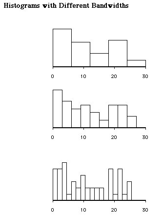
The concepts of noise and smooth are perhaps best understood by using the well known histogram. The appearance of the histogram is largely controlled by the number of bars used to depict the data. When many bars are used the pattern of the data may look jittery as shown in the last histogram of Figure 1. Here the details are great and the reader may wonder if a simpler underlying form exists. On the other hand, the use of too few bars may obscure patterns in the data that are important to the viewer as illustrated in first histogram of Figure 1. In this case the summarization is great and the reader may wonder if some important detail is missed. The central panel of this figure presents and intermediate number of bars. In this view balancing smooth and noise is essentially balancing summary and raw data. For a demonstration of bandwidth problem, you may download the Xlisp-Stat program entitled bandwidth.lsp from http://www.creative-wisdom.com/computer/lisp/histogram.html.
Figure 1 Histograms with Different Bandwidths
Another factor determining the noise level of a graph is the degree of data structure imposed by the data analyst. For example, a regression line summarizes the relationship between the variables and seeks to minimize residuals, but it assumes homogeneity of variance and linearity of the data. This assumption of structure may be very inappropriate in the early phases of data exploration. On the other hand, some procedures may be too flexible in that they overfit the data and inappropriate suggest structure that is unique to a sample. Just as in the case of balancing noise and smooth, balancing the imposition of structure versus the use of flexibility involves the subjective judgment and expectation of the data analyst.
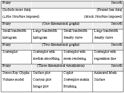
Building on these ideas, graphical techniques can be conceived as occurring in the two-dimensional space of smoothness/noise and dimensionality of the data being depicted. Table 1 orders a number of statistical graphics along these dimensions. The horizontal dimension of smoothness/noise is conceived as a continuum, while the vertical dimension of variable dimensionality is conceived as discrete. Ranging from one- to multi-dimensional graphing techniques, there exist the tensions between much data and less data, and between little imposed structure and more imposed structure. In the following section, we review a number of statistical graphics meant to display one-, two-, three- and higher-dimension data in light of their noise versus smooth characteristics.
TABLE 1 Noise-smooth Continuum
There are two dimensions of statistical graphing. The horizontal dimension illustrated here is noise-smooth while the vertical dimension is the number of variables or the dimension of data.
Variations in Graphics for Visualizations
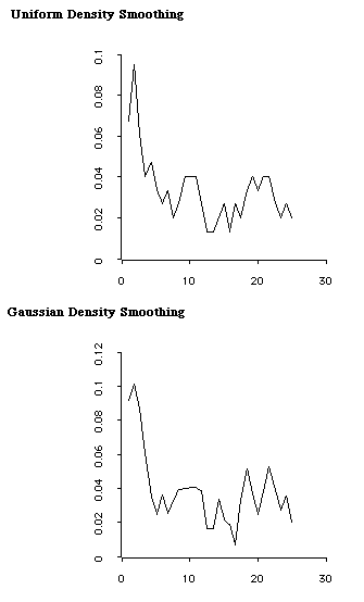
The histogram is perhaps the most common graphic for displaying the distribution of a single variable. While constructing a histogram seems to be straightforward, the appearance of the histogram is arbitrarily tied to the interval width used as shown in Figure 1. As an alternative to a histogram, statisticians have developed several smoothing algorithms to estimates the underlying shape of the data. (Nadaraya, 1965; Hardle, 1991). The process can be thought of as constructing numerous histograms of differing interval widths and averaging the heights of the different bars--a sort of average all possible histograms. Figure 2 presents density smoothes applied to the data depicted in Figure 1. Here the density shapes differ based on the smoothing algorithm used to average across data points.
Figure 2 Kernel Density Smoothing
A histogram with a large interval width can be smoother than a kernel density curve with a small interval width. Given that both kinds of graph use the same interval width, histograms and density curves are positioned on the continuum as shown in Table 1. Following current practice in the statistical literature we will use the term "bandwidth" rather than the more specific "interval width" since this term is more appropriate for discussions of continuous data and functions.
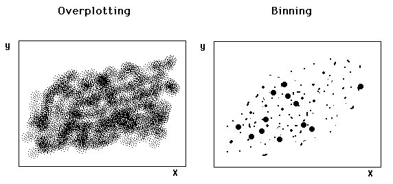
Bivariate data are usually presented in a scatterplot, which is also subject to the bandwidth problem. If there are thousands of data points, the scatterplot will appear to be a messy cluster of ink. The binning approach suggested by Carr (1991) directly attacks the problem of overplotting. In this approach data points are grouped in bi-variate intervals, then plotted in a scatterplot with larger symbols indicating more data points in an interval.
Figure 3 Binning
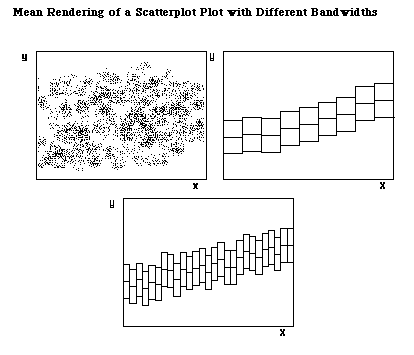
Another way to simplify a noisy scatterplot is smoothing. Again, bandwidth choice inevitably becomes an issue. When encountering a noisy scatterplot, one can search for a pattern by dividing the data into several portions along the x-dimension, computing the median of y in each portion, and then look at the trend by connecting the medians (Tukey, 1977). Mihalisin, Timlin and Schwegler (1991) extended this idea by using the mean rather than the median and introducing bandwidth as a variable. In Figure 4 the relationship between X and Y is depicted in this fashion called mean rendering. The data pattern is clear in the upper right graph where the bandwidth is wide. The bandwidth of the lower graph is three times smaller and thus gives a noisier appearance.
Figure 4 Mean Rendering
Besides median smoothing and mean rendering, a regression line is another way of structure imposition to bivariate data. Regression assumes the linear function and is even more forceful than median smoothing and mean rendering, which allows local fluctuations departing from linearity. Moreover, a mean rendering imposes more structure on the data than a median smoothing, because interpretation of the mean generally depends on the normality of distributions. The positions of these graphics on the noise-smooth continuum are shown in Table 1.
Multivariate research is important in all areas of scientific inquiry. Take the most basic measurement of an element as an example. To describe the condition of an element in a phase space requires at least the co-ordinate of its 3D physical position, its temperature, pressure and density at a given time. In this simple case there are already seven variables together simultaneously. If the subject matter to be studied is more complicated, it will involve much more dimensions. Also, in social sciences many variables interact with each other simultaneously. Multivariate visualization comes to the fore when researchers have difficulties in comprehending many dimensions at one time. There are numerous multivariate visualization techniques. In this paper we discuss only Stereo-Ray Glyphs, volume model, surface plot, contour plot, image plot, coplot, scatterplot-matrix brushing, and Animated Mesh Surface that are presented in Table 1. We recommend the reader consult Keller and Keller (1993) for additional techniques.
Different Visualization Methods for Multivariate Data
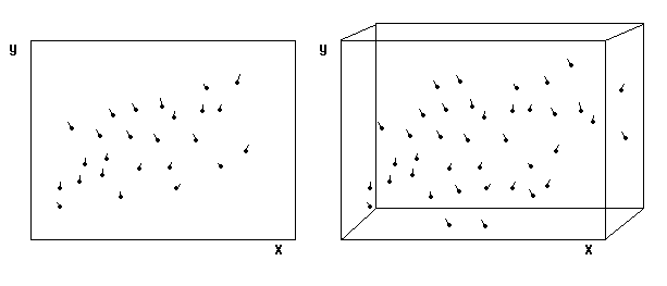
A 3D plot with X, Y, and Z variables on three axes -- called a spin-plot -- is a common way to illustrate multivariate data. The user can rotate the plot to get a sense of depth. In practice, it is difficult to find out how the data spread and cluster even if we rotate the 3D plot, because our binocular depth perception is of limited accuracy. Abandoning the conventional spin-plot, Carr and Nicholson (1988) added one more dimension to a 2D or 3D plot by using the analogy of a meter. In a meter the value increases as the needle moves from the left to the right. In Figure 6 the change of the third variable is illustrated by attaching a ray glyph, which resembles to a meter, to each data point. The angle of the "tail" of each data point indicates the size of change in the moderating variable. In order to view the 3D plot with an illusion of depth, Carr and Nicholson placed the same two graphs side by side and recommended the user to look at the graphs with a stereopticon .
Figure 5 Stereo Ray-Glyphs
Stereo-Ray Glyphs have at least two draw-backs. First, it is inconvenient for researchers to examine the graphs with a stereopticon. Second, Stereo-Ray Glyphs may not work when overplotting occurs and the data pattern is buried by the noisy graph. The overplotting problem may be overcome by using a volume model.
This addition of a meter is an example of the general strategy of changing the appearance of the symbol that represents an observation. Other packages such as DataDesk (Velleman, 1992) and XLisp-Stat (Tierney, 1990) also allow the user to change the shape or color of observations based on values of a third variable.
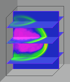
Nielsen et al. (1994) asserted that the future of visualization is in volumes. The volume model overcomes several problems occurring in other techniques such as overplotting and perspective limitation. A volume model can be viewed as an enhancement of a 3D plot. In a conventional 3D plot, the data points are symbolized by opaque dots. In the volumetric visualization, each data value is denoted by intensity. The higher the data value is and the more data that lie along the region, the more opaque the line of sight is. In this way, the researcher can construct a transparent "data cloud." At the early stage of exploratory data analysis, a volumetric visualization is beneficial. A volume model shows all data. and thus the researcher can detect whether there exist non-linear relationships and locate the clusters of data. In addition, Kaufman, Hohne, Kruger, Rosenblum and Schroder (1994) argued a translucent volume model is perspective independent. Moreover, the user can slice a vertical or a horizontal cross-section to look at the relationships at certain points as shown in Figure 6. Fortner (1993) warned that the strength of showing all data is also a weakness. It takes very complicated computational skills to visualize so much data. Failure to do so may result in formation of a big blob.
Figure 6 Volumetic Model
Surface plot/Contour plot/Image plot
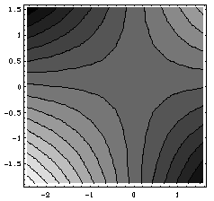
A surface plot is easily confused with a smoothed mesh surface plot. In the former, the surface of the raw data are depicted while in the latter a smoothed summary surface is presented. In a surface plot the data values of X and Z are plotted along the two horizontal axes while the data values of Y determine the height of the vertical axis. The appearance of a surface plot is tied to the grid size like the shape of a histogram is affected by the bandwidth. Small bandwidth will lead to a surface plot that appears with many spikes while larger bandwidth leads to an appearance of smoother mountains. Because a viewer's perception of the surface plots depends on the viewpoint, they are sometimes called perspective plots. It is desirable for the researcher to vary the grid size and the perspective of the surface plot while doing data exploration.
In order to overcome the viewpoint limitation, a contour plot takes a bird's eye view. In a contour plot, the Y-axis is hidden and the data values in Y are represented by connected lines at discrete levels. Although a contour plot is less viewpoint-dependent than a surface plot, it is still not as perspective-free as a volume model.
Another shortcoming of a contour plot is that in some cases it cannot show "holes" in the data. For example, when a dataset has lower data values at the center, a contour plot cannot show the "hole" clearly, because it assumes that contour lines of lower levels are longer and are located at the outer edge while the shorter isolines denote higher values. Moreover, the bandheight of the isolines determines how a contour plot appears. Therefore, researchers should consider construct contour plots with different bandheights in order to not to be "stuck" in one depiction.
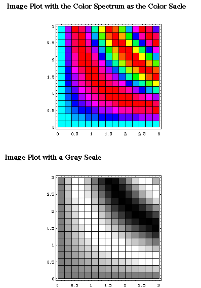
An image plot is a bird's eye view of a surface plot, too. In an image plot the data values are represented by different color hues. The advantage of this approach is that the maximum and minimum values are easily highlighted. However, it is more difficult for humans to perceive change by color shift than by spatial difference. More importantly, choices of color hue, intensity and saturation would highly affect the perception. Bertin (1983) found that if the conventional color spectrum is used, red and blue, which are located at the two ends, are similar rather than different,. And yellow, the lightest color at the center of the spectrum, looks more outstanding. The top panel of Figure 7 illustrates this problem. Encarnacao et al. (1994) argued that a color scale based upon perceived brightness is usually more effectiveness. However, in some software packages, it is difficult, if not impossible, for the user to change the default setup of the color scale. In this case, an image plot with a gray scale as shown in the bottom panel of Figure 7 is easier for the viewer to perceive the height.
Figure 7 Image Plots
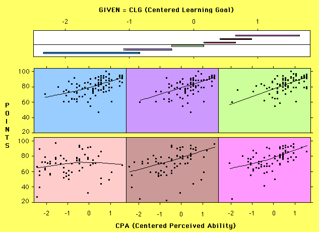
Coplot is an abbreviation for conditioning plot. This technique is helpful in detecting the presence of interaction effect of multiple variables. When viewing an interaction, different slopes are apparent between X and Y at different levels of Z. If Z is broken into a series of intervals, the regression of Y on X in each Z interval can be assessed with an eye open for differences in slope across the series of plots.
A coplot as implemented in the S-plus software (Statistical Sciences, 1993) is presented in Figure 8 . The top panel is called the given panel, which shows a series of intervals across a third variable. The panels below are called dependence panels, which shows a series of scatterplots of two other variables. In this example, the two variables on the dependence panels are number of points obtained in a mathematics class and a scaled value of perceived ability in mathematics. In the given panel, there is a scale for learning goal orientation and a series of overlapping lines. Each line represents the range of learning goal which is included in a corresponding scatterplot. The first line reflects the range of the learning goal scores included in the first (upper left) scatterplot, with the second line indicating the range of learning goal scores included on the next scatterplot and so on. The example presented in Figure 8 shows how the slope relating points and perceived ability fluctuates toward zero in the middle of the learning goal dimension while exhibiting positive slope elsewhere. Such a pattern would not be self-evident in examination of simple marginal distributions or unconditionalized scatterplots.
Figure 8 Coplot
The reader may note that the intervals overlap--an aspect necessary to maintain the continuous influence of points on the conditional regression slope. Because the degree of overlap reflects the degree of local conditionalization for each scatterplot, this aspect of the plot is modifiable in the S-Plus implementation. The length of the conditioning intervals also varies because they reflect the density of points in different regions of the multidimensional space.
A coplot is a smoother technique than those discussed above, because the regression lines impose certain structures on the data. On the other hand, the number of the levels of dependence panels can be viewed as a kind of bandwidth.
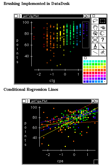
A scatterplot matrix is a collection of scatterplots organized in a matrix analogous to a correlation matrix. Scatterplot matrices designed for exploratory data analysis are usually linked as found in the DataDesk computer package (Velleman, 1992). In this example we show only two scatterplots. Linked plots are indexed so that alteration of an observation on one plot leads to the same alteration of the case on all other linked plots. By brushing (coloring) cases along one scale (Figure 9a), the values along this scale can be perceived in other bivariate plots, which do not include this variable on the axes (Figure 9b). DataDesk has a built in function for producing colored regression lines as shown in Figure 9b. The plot shows the regression lines of perceived ability against points conditioning to six levels of learning goal. Here it can be seen that the regression line for orange cases (those that are at the center of the learning goal scale) is relatively flat while other regression lines are otherwise positive.
Figure 9 Brushing and Linking
Like a coplot, the number of sliced segments affects the conditional regression lines. Clearly the exploratory mode of such analyses leads to sets of possibilities and should not be confused with the results of confirmatory data analysis. Unlike a coplot in which the given panel has overlapping intervals, the colors in a brushing scatterplot cannot overlap since each case must be of one color or another. In this analysis the number of color categories and the width of the categories is arbitrary and several coloring schemes should be attempted to insure the slopes are not simply artifacts of an unusual grouping scheme. We recommend using both co-plots and linked scatterplots to obtain a comprehensive view of the data. One drawback of brushing scatterplots is that the shift of conditional regression lines cannot be animated in most packages. This problem can be solved by the Animated mesh Surface model.
A mesh surface plot is a simplification of a surface/perspective plot. Figure 10 illustrates how a mesh surface is formed by joining the regression lines of the predictor variable (perceived ability) against the criterion variable (self-regulation) across all levels of the second regressor (learning goal). In this example, three conditional regression lines are drawn. The first one is plotted given that the learning goal value is one standard deviation above the mean. The second one is plotted on the condition that the learning goal value is at the mean, and the last condition is one standard deviation below the mean of the learning goal value. In this example the procedure is implemented in Mathematica (Wolfram, 1991). The remaining plots illustrate the lines extended across the continuum to produce a surface and the surface being rotated to improve perspective. One merit of this approach is that in the first step it shows the regression lines in the three-dimensional context of the data. The final plot shows the surface with the data omitted.
Figure 10 Animated Mesh Surface of Two-Way Interaction
By animation, this technique can be easily extended to the visualization of four dimensional data. In Figure 11 there are three regressors--perceived ability, extrinsic motivation, and performance goal, and one outcome variable--deep thought processing. In the first box we connect the conditional regression lines of performance goal against deep thought processing across all levels of extrinsic motivation when the perceived ability is low. The same procedure repeats as the value of perceived ability increases. As a result, we produce a series of mesh surfaces as a movie. The user can either play the entire movie to get an overall impression or look at the graphs frame by frame. Interesting results may be discovered by this procedure. For instance, in the fourth box of Figure 11 it indicates that at a certain value of perceived ability, the mesh surface is flat and all main effects are flat.
Figure 11 Animated Mesh Surface of Three-Way Interaction
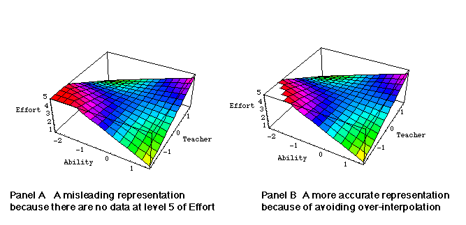
However, the user should be cautious not to over-interpolate the function to areas where no data are found empirically. For example, in Figure 12 the lowest scores of the perceived ability did not reach the minimum of the scale, but the surface stretches all the way to the corner of the box as shown in Panel A. The graph of Panel B is a more accurate representation of the data.
Figure 12 Clip-fill
The Animated Mesh Surface shown here requires advanced programming skills in Mathematica. In order to make this technique accessible to more social science researchers, we developed a HyperCard front end program to automate the computing process (Behrens & Yu, 1994). This HyperCard program can call up the functions of Mathematica through MathLink. In the HyperCard front end the user is required to enter several parameters. An error checking sub-routine is implemented to ensure the accuracy of the parameters. Nevertheless, the program is so flexible that the user can make any change or correction at any point . After the parameters have been set and the variables have been selected, the user would be prompted to choose several options such as a 2-way or 3-way interaction. Then the equation and the function would be exported to Mathematica. If the user knows the basic of Mathematica programming, he can edit the function in order to control the output. As mentioned before, we believe that visualization is a process of exploration. On one hand we want to simplify the computing procedure to encourage more use of Animated Mesh Surface. On the other hand we would like to leave rooms for manipulation and exploration by the researcher.
Wickens, Merwin and Lin (1994) concluded that a mesh surface does not benefit the user in understanding the data. However, in their study only a few data points were presented. We are unsure whether the result can be generalized to the visualization of complicated dataset, in which the smooth provided will have more benefit. In addition, the surface used in that study was static in shape and animated only to change viewing position rather than changing the function itself as shown here. Clearly, the psychological processes underlying graph perception for different tasks is important and only in its infancy..
The understanding of animated mesh surfaces is highly perspective-dependent. Although this shortcoming is possibly remedied by rotating the graph, a rotation will lead to the re-drawing of the entire movie. In order to compensate the perspective limitation, we recommend to present an Animated Mesh Surface, contour plots and image plots side by side . It is important to note that here the contour plots and the image plots are no longer the bird's eye view of the rough surface plots. Rather smoothed mesh surfaces are used.
Some of the visualization techniques described here have existed for many years prior to the advent of statistical computing. However, computing power has led to new possibilities that help us reassess our previous practice. For example, the use of color in statistical graphics has long been neglected because of the lack of widespread color producing software and hardware. This change in technology is leading to a fast change in the type of graphics which psychologists can create and use. A concomitant research effort in the psychological aspects of these new displays is needed. The work of Wickens et al. (1994). is a step in the right direction though, as noted above, such laboratory tasks may or may not be well aligned with the goals and procedures of actual use.
Visualization techniques are often considered valuable to meet the demands of multivariate data because of their ability to portray numerous aspects of the data simultaneously. The process of visualization can be viewed as an adjustment of noise and smooth. However, there is no optimal bandwidth and structure that can be applied to most situations. Researchers are encouraged to look at the data in different ways. In this sense visualization is a creative activity. We hope the powerful tools demonstrated in this paper will allow psychologists to graphically explore and present high-dimensional data in addition to reporting algebraic expressions such as eigenvalues and slopes for interaction effects. Often such summaries are too complicated to be interpreted directly so the user is simply left with the conclusion that the result is significant or not significant, while remaining ignorant of the actual form of the function.
While visualization techniques in physical sciences effectively exploit the physical analogy of their subject with our perception of physical objects, we have argued that all visualization is based on analogy and rules for statistical analogy are already present in psychological research tools such as the histogram and scatterplot. Therefore we believe the visualization techniques applied in other fields can be successfully applied, with appropriate modification, to psychological phenomenon. The success of such endeavors will depend on detailed knowledge of psychological systems and statistical computing as well as energetic creativity.
Behrens, J. T. & Yu, C. H. (1994, June). The visualization of multi-way interactions and high-order terms in multiple regression. Paper presented at the Annual Meeting of the Psychometric Society, Urbaba-Champaign, Illinois.
Bertin, J. (1983). Semiology of graphics. Madison, Wisconsin: University of Wisconsin Press.
Brooks, F. P. (1993). A vision for visualization. In G. M. Nielson & D. Bergeron (Eds.) Proceedings of 1993 IEEE Visualization Conference (p.2). Los Alamitos, CA: IEEE.
Bulter, D. L. (1993). Graphics in psychology: Pictures, data, and especially concepts. Behavior Research Methods, Instruments, and Computers, 25, 81-92.
Carr, D. B. (1991). Looking at large data sets using binned data plots. In A. Buja & P. A. Tukey (Eds.) Computing and Graphics in Statistics (pp.5-39). New York: Springer-Verlag.
Carr, D. B. & Nicholson, W. L. (1988). Explor4: A program for exploring four-dimensional data using Stereo-Ray Glyphs, dimensional constraints, rotation, and masking. In W. S. Cleveland & M. E. McGill (Eds.). Dynamic Graphics for Statistics (pp.309-329). Belmont, CA: Wassworth.
Cleveland, W. S. (1993). Visualizing data. Murray Hill, NJ: AT&T Bell Lab.
Encarnacao, J., Foley, J., Bryson, S, Feiner, & S., Gershon. (1994). Research issues in perception and user interface. IEEE Computer Graphics and Applications, 14, 67-69.
Fortner, B. (1992). The data handbook: A guide to understanding the organization and visualization of technical data. Champaign, IL: SpyGlass, Inc.
Hardle, W. (1991). Smoothing techniques: With implementation in S. New York: Springer-Verlag.
Hesselink, L., Post, F. H. & Wijk, J. J. (1994). Research issues in vector and tensor field visualization. IEEE Computer Graphics and Applications, 14, 76-79.
Kaufman, A., Hohne, K. H., Kruger, Rosenblum, L & Schroder, P. (1994). Research issues in volume visualization. IEEE Computer Graphics and Applications, 14, 63-66.
Keller, P. R., & Keller, M. M. (1933). Visual cues: Practical data visualization. New Jersey: IEEE Press.
Mihalisin, T., Timlim, J & Schwegler, J. (1991). Visualization and analysis of multi-variate data: A technique for all fields. In G. M. Nielsen & L. Rosenblum (Eds.) Proceedings of 1991 IEEE Visualization Conference (p.171-178). Los Alamitos, CA: IEEE
Nadaraya, E. A.. (1965). On nonparametric estimation of density functions and regressions curves. Theory of Probability and its Application, 10, 186-190.
Nielsen, G., Brunet, P., Gross, M., Hagen, H. & Klimenko, S. V. (1994). Research issues in data modeling for scientific visualization. IEEE Computer Graphics and Applications, 14, 70-76.
Statistical Sciences (1993). S-PLUS for Windows. Seattle Washington: Statistical Sciences.
Tukey, J. W. (1977). Exploratory data analysis. Reading, MA: Addison-Wesley Publishing Company.
Tukey, J. W. (1980). We need both exploratory and confirmatory. American Statistician, 34, 23-25.
Tukey, J. W. (1986a). Data analysis and behavioral science or learning to bear the quantitative man's burden by shunning badmandments. In L. V. Jones (Ed.). The collected works of John W. Tukey, Volume III: Philosophy and principles of data analysis: 1949-1964. Pacific Grove, CA: Wadsworth.
Tukey, J. W. (1986b). The collected works of John W. Tukey, Volume III: Philosophy and principles of data analysis: 1949-1964. L. V. Jones (Ed.). Pacific Grove, CA: Wadsworth.
Tukey, J. W. (1986c). The collected works of John W. Tukey, Volume IV: Philosophy and principles of data analysis (1965-1986). L. V. Jones, (Ed.). Pacific Grove, CA: Wadsworth.
Tukey, J. W. (1988). The collected works of John W. Tukey, Volume V: Graphics. W. S. Cleveland, (Ed.). Pacific Grove, CA: Wadsworth.
Wicken, C. D., Merwin, D. H. & Lin, E. L. (1994). Implications of graphics enhancements for the visualization of scientific data: Dimensional integrity, stereopsis, motion, and mesh. Human Factors, 36, 44-61.
Wolfram, S. (1991). Mathematica: A system for doing Mathematics by computer. Reading, MA: Addison-Wesley Publishing Company.
Velleman, P. F. (1992). DataDesk Handbook. Ithaca, NY: Data Description Inc.
This article is a shorter version of my dissertation.
Navigation
Simplified Navigation
Table of Contents
Search Engine
Press this icon to contact Dr. Yu via various channels